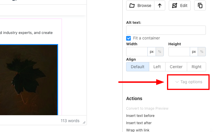
When building or editing a page, applying custom styles helps improve layout, spacing, and overall appearance. The Tag Options panel in the Page Editor lets you manually enter styles for spacing, alignment, formatting, and more.
How to Access the Styling Options
To start adding styles, simply click ‘Tag Options‘ on the right-hand panel of the Page Editor.
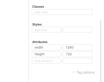
You’ll see three main fields:
• ✔ Classes – Use this to apply predefined CSS class names.
• ✔ Styles – This is where you enter custom styles using CSS key-value pairs (e.g. margin: 20px).
• ✔ Attributes – Add any additional HTML attributes here (optional).
1. Spacing: Margin & Padding
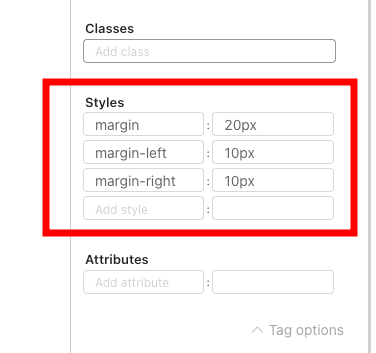
➤ Margin (Space Outside an Element)
Use margin to create space around the outside of an element.
Examples:
• margin: 20px – Adds 20px of space on all four sides (top, right, bottom, and left).
• margin-left: 10px and margin-right: 10px – Override the left and right margins individually.
Result:
• Top and bottom margins = 20px
• Left and right margins = 10px
💡 Tip: You can override general margin values with side-specific ones like margin-top, margin-left, etc.
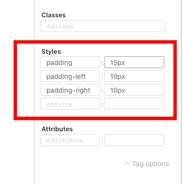
➤ Padding (Space Inside an Element)
Use padding to add space inside an element, between the content and its border.
Examples:
• padding: 15px – Adds 15px of padding on all sides.
• padding-left: 10px and padding-right: 10px – Override the left and right padding values.
Result:
• Top and bottom padding = 15px
• Left and right padding = 10px
💡 Tip: Like margin, padding can be customised using side-specific styles such as padding-top or padding-bottom.
2. Display & Alignment
If you’d like to create a flexible layout or adjust how content sits within a container, you can do so using a few simple style rules — as shown in the example below.
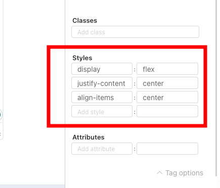
These styles help centre items both horizontally and vertically, which is especially useful for aligning text, buttons, or other content in the middle of a section.
Style Breakdown:
• display: flex – Turns the element into a flex container, activating flexbox behaviour.
• justify-content: center – Horizontally centres all child elements inside the container.
• align-items: center – Vertically centres the child elements.
Result:
All content inside the flex container will be perfectly centred — both horizontally and vertically.
💡 Tip: Flexbox is especially useful for centring buttons, icons, text blocks, and more within divs or containers.
3. Quick Overview: Manual Entry Fields
• Classes Field – Add any CSS class names that are already defined in your theme or custom styles.
• Styles Field – Enter individual CSS rules (e.g. padding: 10px) directly here.
• Attributes Field – Use this for adding extra HTML attributes when needed (e.g. data attributes or aria-label).